Dashboard Design Lab: Week 3 - Color Theory & Usage

In our last session of Dashboard Design Lab, we focused on Padding and Whitespace and how spacing alone can make a dashboard feel cleaner and more readable. This week, we shifted into one of the most recognizable parts of design: Color Theory and Usage.
Color is one of the fastest ways to guide attention, signal meaning, and shape how users experience your dashboard. Used well, it brings clarity and structure. Used poorly, it becomes a distraction. This session focused on how to use color with purpose and intention across any dashboarding tool.
Why Color Matters in Tableau and Power BI
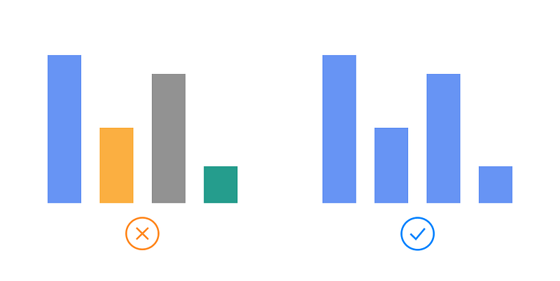
Reduces Noise: Start in grayscale and introduce color only where it supports the story. A dashboard with too many colors makes the user work harder to understand the content.
Builds Consistency: Decide what each color represents and use it the same way throughout the dashboard. Consistency builds trust and helps users understand meaning faster.
Guides Attention: Use color to spotlight what matters most, such as KPIs, important trends, or outliers. Color should point the user where to look first.
Improves Accessibility: Many users experience color differently. Choose palettes that are colorblind friendly, and test contrast between text and backgrounds to make sure your content is readable.
Shapes Emotion: Color sets the tone of a dashboard. Warmer colors draw attention and feel more urgent, while cooler colors feel calm and neutral. Understanding this balance improves how users interpret your message.

Key Concepts to Keep in Mind
Assign Clear Color Roles: Decide what each color means before you start building. Use it the same way across charts and sections.
Use Color for Highlights, Not Decoration: Reserve strong or bright colors for key values, exceptions, and important comparisons.
Test for Accessibility: Use online color-blindness simulators and contrast checkers to make sure text, marks, and backgrounds are readable for everyone.
Stay Within a Controlled Palette: Choose a small, well-balanced palette and stick to tints, tones, and shades instead of adding new colors.
Support the Story: Make sure your color choices reinforce the narrative of the dashboard. If the color is not helping explain the insight, it does not need to be there.
When used with intention, color becomes more than decoration. It becomes a communication tool that helps users understand the story behind the data without feeling overwhelmed.
If you enjoyed this topic, make sure to share and subscribe for free to follow along with the Dashboard Design Lab series. We’ve shifted to a bi-weekly cadence, so check back soon for our Week 4 review.